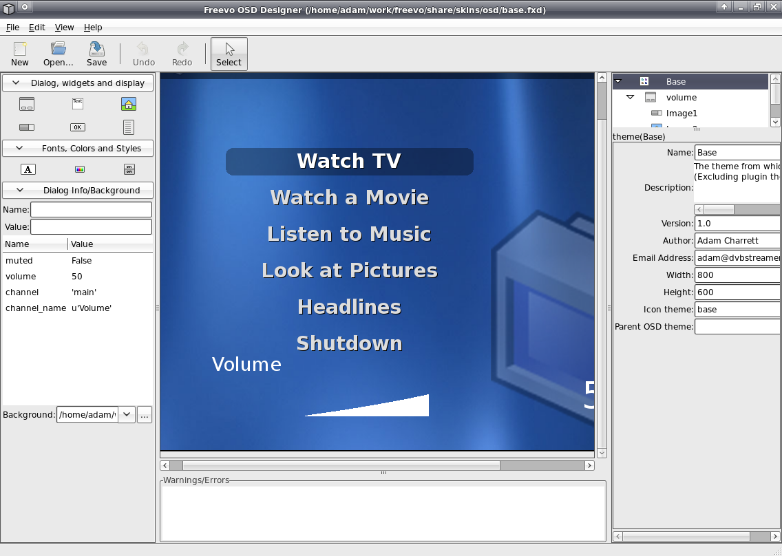
OSD Designer
The OSD Designer is a Glade like GUI for designer and editing OSD skins for Freevo. To start the designer:
freevo osddesigner
To start the designer with a current skin:
freevo osddesigner share/skins/osd/base.fxd

OSD Skins
Skin/Theme Information
OSD Skins like menu skins are designed for a specific geometry (width and height properties) and then scaled/stretched to meet the geometry that Freevo has been configured for . They can also, like menu skins, inherit from other skins (include property) making creating new skins easier as you only need to change the dialogs that you want to edit. In addition to geometry and inheriting from another skin, they can also specify an icon theme (icon theme property) to be used. An Icon Theme is a directory containing images which use well known names to describe them. For example a well known name that may be included in all Icon Themes might be dialog_bg.png which would be used as the background image for all dialogs.
Dialogs
A Dialog is the name given to the unit that is display on the screen to present the user with information. Common dialogs are:
Message Dialog - Displays a message and an Ok Button.
Question Dialog - Displays a question and several buttons allowing the user to chose a suitable response.
Play State - Displays the current position in the movie and its total length.
EPG Information - Displays information on a TV channel.
In order for freevo to display information on a dialog, when the dialog is being rendered freevo provides a dictionary of information. What is contained in this dictionary depends on the type of dialog being displayed. For example a simple message dialog would have a string for the message and a button model (holding the buttons state) or an EPG dialog would have a string for the current channel, some time information for the current time, details on the currently program to display etc. The OSD Designer knows about the common dialogs and will generate a dictionary of appropriate information to allow you to see what you dialog might look like.
Dialog Items
Dialogs uses the following items to display information to the user:
Image - Displays an image, either from a fix filename or from an expression. The image can be scaled to fit the space allocated.
Text - Displays a string, either a fixed string specified in the skin or an expression using the dialog dictionary.
Percent - Displays a percentage value using a segment of a specified image. The image is displayed either increasing in size horizontally (left to right) or vertical (bottom to top)
Widget - Generally a button or radio/toggle button. A model containing the current state along with a Widget Style is used to determine how to render the widget.
Menu - Displays a vertical menu of items. A Widget Style is also used to determine how the menu is rendered.
Colors and Font
Having to remember the color or font settings for each item in a dialog or skin can be a pain, therefore skins can also contain simple templates that can be reference by a name. These can then be altered once to change all the place a color or font is used.
Font - Contains the font family size and color to be used.
Color - Maps a name to a color (includes alpha).
Widgets, Styles and States
A Widget is an item of a dialog that the user can interact with. For example a common widget will be the Button. Widgets have a current state that they are in, for a Button this would be Not Selected, Selected, Pressed.
A Style is a way to draw a widget when it is in different states, and a WidgetState is how to render a widget when it is in that state. A WidgetState can contain Image, Text and Percent items but not other widgets.
